Legend Creator - Fill Patterns tool in Creators group of Startup toolset helps create legends for fill patterns as shown on any Sheet or All.
After the ribbon button is clicked, a dialog will appear.
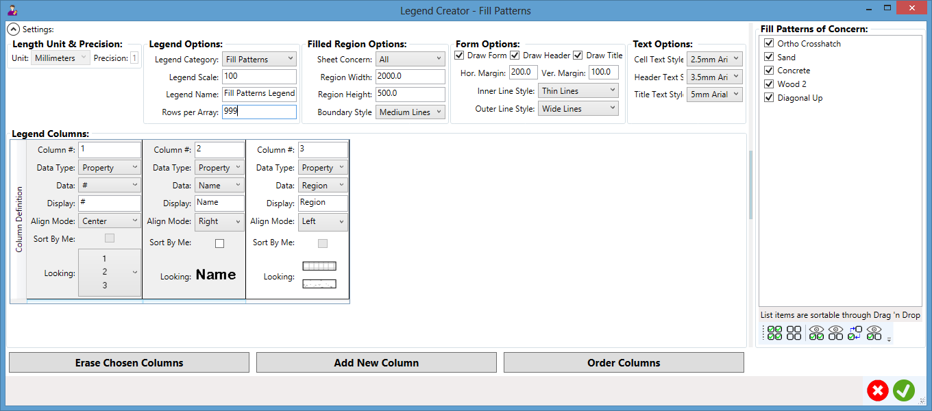
Settings:
Length Unit and Precision: to show length unit and precision settings by Revit.
- Unit: to show what length unit is set by Revit.
- Precision: to show what precision of the length unit is set by Revit.
Legend Options: to set options for the coming legend.
- Legend Category: to set which category to take care of.
- Legend Scale: to set what scale to use by the legend.
- Legend Name: to set the name of the legend.
- Rows Per Array: to set how many rows to have in each array in the legend.
Filled Region Options: to set options for filled regions.
- Sheet Concern: on which sheet the fill regions appear; can be All.
- Region Width: what width the filled region will have.
- Region Height: what height the filled region will have.
- Boundary Style: the boundary line style of the filled region.
Form Options: to set options for the form of the legend.
- Draw Form: to draw form.
- Draw Header: to draw header.
- Draw Title: to draw title.
- Hor. Margin: to set the horizontal margin for legend cells.
- Ver. Margin: to set the vertical margin for legend cells.
- Inner Line Style: to set the style for inner lines.
- Outer Line Style: to set the style for outer lines.
Text Options: to set options for texts in the legend.
- Cell Text Style: to set the style for cell texts.
- Header Text Style: to set the style for header texts.
- Title Text Style: to set the style for title texts.
Filled Patterns of Concern: to list out all concerns as specified by category/level/sheet
- Line: each line can be checked; their order can be changed through simple drag & drop
- Buttons: Check All/UnCheck All/Show Checked/Show UnChecked/Invert Chosen/Show All
Legend Columns: to set content and looking for each legend column
- Column #: the number and position of the column.
- Data Type: the data type (Property or Parameter).
- Data: what data to care for by the column.
- Display: what display to use in the legend for the data.
- Align Mode: what alignment (Left/Center/Right) to apply.
- Sort by Me: to sort legend rows by the data value of this column, if checked.
- Looking: what the column content may look like in the legend.
Buttons:
- Erase Chosen Columns: to erase chosen/highlighted columns from the grid.
- Add New Column: to add a new column to the grid.
- Order Columns: to re-order columns based on their number (#) specifications.
- Cancel: to dismiss the dialog without doing anything to the model.
- OK: to close the dialog and create the legend into the model accordingly.
If OK button is clicked, the legend will be created accordingly.
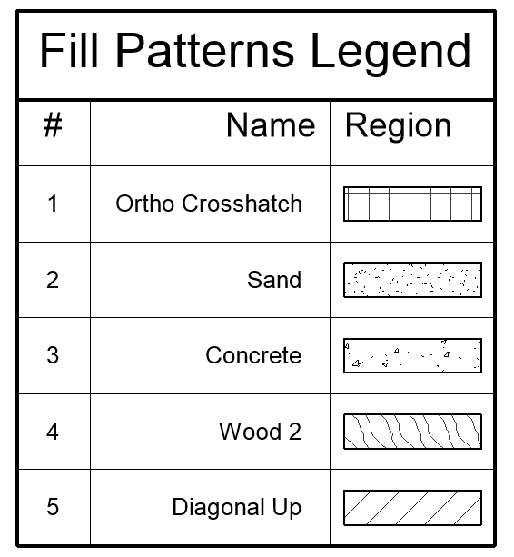
As expected, the legend have a form with wide outer lines and thin inner lines and have both title and header with bigger but different font sizes and even types than those cell texts, as specified in the dialog. The first Number column uses the very simple figure and is aligned to center of each of their cells. The Name column is aligned to right but Region to left so that they look closer and nicer.
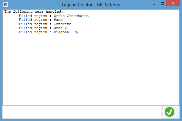
An information box will finally report what have been done.